
Safe Appetite

Safe Appetite is a mobile app designed to address a common and serious problem: the uncertainty and anxiety experienced by people living with allergies, intolerances, or dietary restrictions when trying a new product or food for the first time. The app helps users quickly and easily identify ingredients they need to avoid in foods, cosmetics, and medicines, using barcode scanning as its core feature.
My role at Safe Appetite:
This was my first project as a UX designer, developed while I was working two part-time jobs and attending in-person classes to enhance my skills. I was the sole designer on the project, so all of the work presented below was carried out entirely by me — from research to final prototype.

The problem:
The potential problem came from the perception that people who lives with restrictive diets, especially those with food allergies and intolerances, feel insecure and frustrated when shopping for food due to the lack of nutritional information available or the absence of clarity on food product labels, resulting in a feeling of fear and lack of belonging of these individuals in food establishments.
The Design Process:
The Design process was based on the Double Diamond method. This process was used to separate the project into 4 distinct stages, namely: Discovering the environment in which the project finds itself, as well as analysing possible existing “pains”, Defining which problems will be the focus of the project, Developing possible solutions and Deliver the final product with a high-fidelity prototype.


🕵️ The Research Stepped In
To design effectively, I first needed to understand the landscape.
What is the experience like for people with allergies, intolerances, and restrictive diets when they eat out?

I knew the findings from desk research weren’t enough. I needed to speak directly to users — to understand their current behaviours, the precautions they take when dining out, what makes them trust a venue or tool designed to support them, and how food establishments currently approach individuals with dietary restrictions.
These and other key questions were asked in one-on-one interviews with 9 participants, including individuals with severe food allergies, food intolerances, and restrictive diets (such as vegans and vegetarians).
🔍 Key Findings
Eating out is rare. Many participants avoid dining out entirely due to a lack of trust in food establishments.
Staff are unprepared. A major source of frustration is the difficulty of asking restaurant staff about allergens or ingredients — they often lack training or confidence in their responses.
There are limited options. Some participants shared experiences of going out with friends only to eat nothing due to a lack of suitable menu items.
Cross-contamination is a major concern. Many do not feel safe because restaurants do not take proper steps to prevent cross-contact between allergens
Because eating out is so rare, many of these individuals prefer to cook at home, where they feel safer and more in control. But this brings new challenges — especially when it comes to shopping.
They’re spending significant time in supermarkets, reading and re-reading labels, researching ingredients, and still sometimes feeling uncertain about what’s safe to buy. This insight marked a key turning point in the project.
🔄 Redefining the Product Vision
Based on this deeper understanding of the users’ reality, I brought these insights to a follow-up meeting with my stakeholder. Together, we redefined the direction of the product.
Originally, the app was focused solely on scanning QR codes in restaurants. But this didn’t align with the everyday pain points of our core users. We pivoted — shifting the focus to barcode scanning for a wide range of products: groceries, cosmetics, and medications.
The goal became clear: to streamline the shopping experience for people with dietary restrictions, reduce decision fatigue, and build trust through reliable information.
After that, I delved deeper into the next step and one of the most important in the process of building a useful, easy-to-use tool that would stood out from the others already available on the market for our users. The Competitor analysis with at least 5 competitors.
Competitor Analysis

Define - Personas

Mary Ellen is our primary persona. She, as a student with allergies, would like to have a faster option to check the ingredients on food labels, so that she can save time when shopping for groceries

Problem Statement & hypothesis
Mary Ellen, an allergic person, needs a faster way to visualize all the ingredients contained in a food product because she wants to save time when buying food.
We believe that building a tool with an ingredients search function that will read the food labels for Mary Ellen we will reduce the time she spends evaluating each ingredient for an allergen. We will know this to be true when we see her good review after using it
Develop - User flow & site map


Low Fidelity Wireframes


Low Fidelity Prototype
After the initial research and early hand-drawn sketches, I developed a low-fidelity prototype to help organise the information that needed to be included in the app.
The goal was to ensure that users could understand how to navigate and use the app’s core features — such as adding dietary restrictions, scanning products, and saving favourites — even at an early stage.
This simple prototype was then used to conduct usability testing with real users before moving forward with the visual design phase.
🧪 User Testing – Low-Fidelity Prototype
To validate the main flow of the app, I conducted a remote usability test using a low-fidelity prototype via Useberry.
The task asked participants to simulate the experience of a person with a peanut allergy and gluten intolerance by adding these restrictions to the app, scanning products, and saving one that was safe to consume as a favourite.
However, I made a key planning mistake: the prototype was entirely in English, and most of the participants I invited were friends with limited English proficiency. This impacted their ability to fully understand the screens and task instructions, and some were unable to complete the flow correctly.
That said, I directly observed 4 users who were fluent in English and able to complete the task successfully. Their feedback confirmed that the flow itself was intuitive and functional when the language barrier was not present.


I fully recognise that this was a simple mistake — one that may seem obvious in hindsight. I wanted the app to be so intuitive that even users with minimal English skills could use it, relying on visual cues like images, colour and illustration.
This experience helped me realise that when an app is only available in one language, its interface needs to be even more self-explanatory and accessible to a broader range of users.
It was a valuable reminder that good UX goes beyond design and flow — it also requires considering real-world context, including language and cultural accessibility.
Digital Wireframes.


The first screen of the app changed slightly across different design versions.
At first, the idea was to prompt users to create an account. However, through user research and early usability testing, I noticed that most people preferred a quicker experience when scanning a product while shopping.
Initial Screen


One of the main changes, therefore, was removing the account creation step. Still, we wanted the app to build some level of familiarity and personal connection. The best way to achieve this without taking up the user’s time was by simply asking for their name they’d like to be called by.


After entering their name, the user is taken to the screen where they can add their allergies, intolerances, preferences, and other dietary restrictions.


This same design was used across all four categories available to users: allergies, intolerances, plant-based community, and preferences.
We also included the option to manually type in a specific ingredient that may not have been listed in the app.
Access screen for adding or editing allergies


Homepage
A clean and straightforward homepage with quick access to all app features.


If a product cannot be found in the system through scanning, the user is given the option to search by name or manually submit the product for review. (see screen below)
Search


If the user doesn’t find a product through scanning or by using the search function, they have the option to add it manually. The app requests specific information about the item, which the user fills in and submits for review.
No product found (scanner fallback)

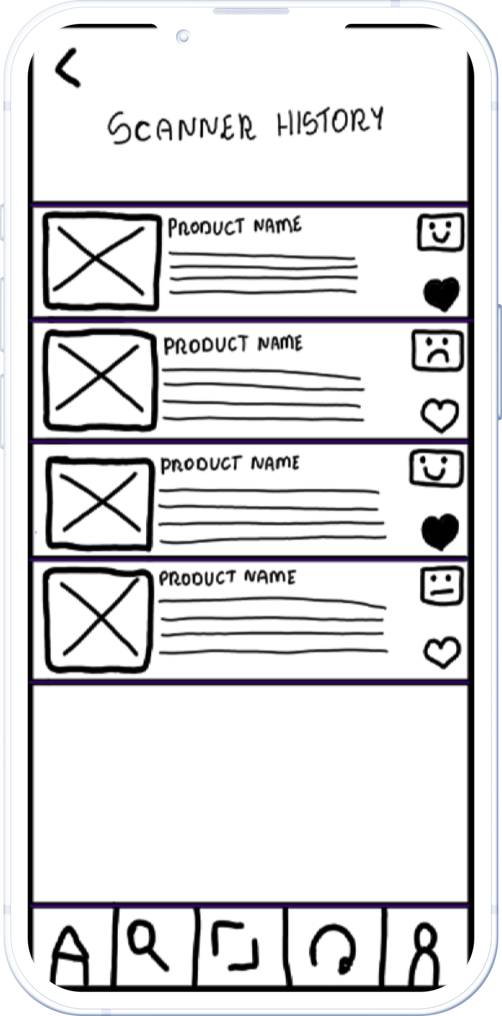

Scanner History
Everything the user scans (whether flagged as safe or not) is automatically saved here.


Favourites
All favourite products are saved in user-edited folders.


A simple profile containing the user’s name, photo (optional), their allergies, and the option to edit their dietary requirements.
User Profile


When a product is selected from the history or favourites, the user is taken to its profile where they can view a breakdown of the ingredients and whether or not the item is considered safe for them, and why.
Product Profile
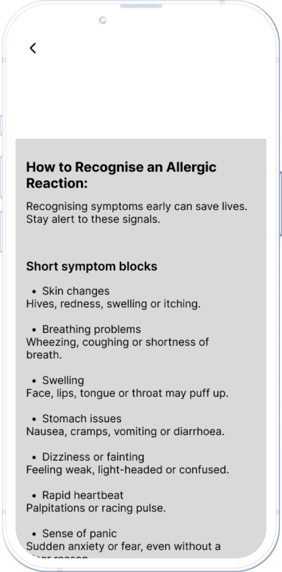


A quick guide to recognising the signs of an allergic reaction and what to do in such cases with direct access to emergency contact numbers.
First Aid


Possible response screens after scanning a product
Refinement & Development
Some time after the initial designs were created, it was decided by my stakeholder that Safe Appetite would no longer be a mobile app, but a web application. As a result, I believe we should return to the initial stages of the design process. This would involve reviewing what has already been done, determining what can be retained, and identifying what needs to be discarded.
I would also like to conduct interviews to better understand which features hold monetary value for customers and which pricing model they would prefer. This will help ensure that the user remains at the heart of the decision-making process.
I also designed a website for Safe Appetite for marketing purposes, to allow users to become familiar with our product and its features before its official launch. I would like to refine the design of the website.
Next Steps…
The ideal course of action now would be to conduct another usability testing with the high fidelity prototype. This will enable us to begin making necessary adjustments to the design and usability of the app and deliver to developers.

Reflection.
I fully immersed myself in this project, determined not to produce amateur-looking designs I pushed myself to deliver something that met all of my client’s expectations, including those she didn’t yet know she had. I finished this project with great care, and ideas were constantly blossoming in my mind. However, I learned that this is part of a designer’s life — a project is never truly 100% finished, as we always strive for more.
This was my first project as a UX designer. Many changes were made from the initial brief I received to the final result presented in this case study. I'd be happy to share more about the project and its journey with anyone interested.